Introduction: Open Face Channel Letters—A Statement of Modern Elegance
In the dynamic panorama of urban landscapes, certain elements capture our gaze and etch lasting imprints. Open Face Channel Letters are among those captivating beacons. At their essence, these are luminous signage characters, unabashedly baring their inner workings and casting a glow that’s hard to ignore. They’re raw, they’re genuine, and they encapsulate a modern design philosophy that values both form and function.
Beyond mere signages, Open Face Channel Letters have transformed into architectural staples. From bustling commercial hubs to chic boutiques, they’ve elevated brand presentations, adding depth and drama. Their transparent nature, showcasing intricate neon or LED configurations, grants them an unmistakable visual prominence in contemporary settings. It’s an invitation to look, to wonder, to engage – a brilliant blend of nostalgia and modernity that few can resist. As we venture deeper, prepare to uncover the allure and technical wizardry that make these letters the luminous giants of urban terrains.
Understanding Open Face Channel Letters
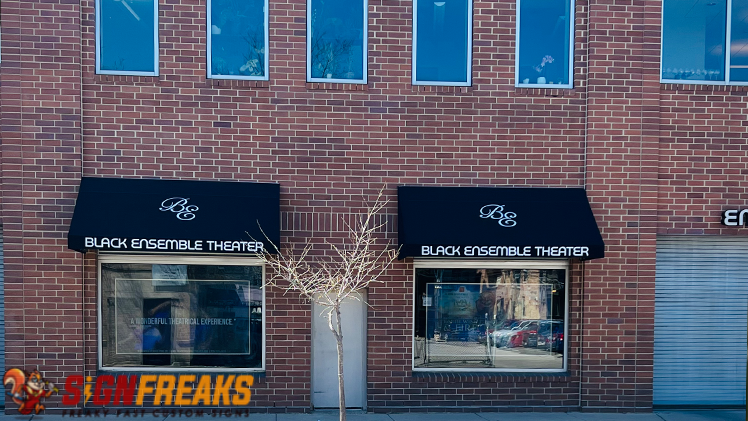
Open Face Channel Letters, in their most elemental form, are three-dimensional signages that leave their internal lighting exposed to the viewer. Unlike their closed counterparts, which either house the light source within a solid facade or hide it behind a translucent shield, these letters courageously showcase their luminescent guts.
These characters possess a depth, enabling the placement of neon or LED lights inside. When illuminated, the play of light doesn’t just emanate forward but also sideways, creating a mesmerizing halo around each character. Their depth combined with their exposed nature bestows upon them a multidimensional radiance, encapsulating both modern flair and a touch of retro elegance.
Now, how do these differ from standard or closed channel letters? The primary distinction is transparency.
- Closed letters direct the light either forward, through a clear or colored front, or backwards, creating a soft glow on the backdrop – but never exposing the actual light source.
- Open Face Channel Letters celebrate transparency, allowing onlookers a clear view of the neon or LED configurations within, a design choice that adds depth and dimensionality to the signage.
Historical Evolution
- The use of signages can be traced back centuries, serving as markers for shops, inns, and various establishments. As civilizations evolved, so did their means of advertisement.
- The open face style has roots in the neon-filled spectacles of the 20th century, where brightly lit signages became emblematic of bustling city life.
However, with advancements in technology and changing aesthetic preferences, there arose a demand for something that bridged the boldness of neon lights with a tinge of subtlety. Enter the contemporary Open Face Channel Letters.
- These modern adaptations retain the nostalgic feel of exposed neon tubes but often incorporate the sleekness of LED’s, resulting in signages that are as much a nod to the past as they are a leap towards the future.
- Today, they stand not just as mere indicators of a business but as art pieces, transforming spaces and facades they grace.
The Anatomy of a Striking Presence
The open face concept is not merely a design choice; it’s a philosophy. At its heart, it’s about embracing vulnerability and showcasing authenticity. By exposing the innards—the neon or LED configurations—designers are making a deliberate statement of honesty and transparency.
The real magic, however, lies in the subtle interplay of light, depth, and shadow. The depth of each letter ensures that the light doesn’t just shoot forward. It spills, dances sideways, creating gradients of luminosity that captivate the onlooker. The shadows, on the other hand, add contrast, making the glow seem brighter, more alive. It’s this intricate ballet of brilliance and obscurity that grants Open Face Channel Letters their unmistakable presence. They don’t just light up a space; they define it, molding perceptions and drawing gazes with an almost magnetic allure.
Technical Components & Craftsmanship
The craftsmanship behind these letters is a fusion of artistry and technical prowess. Aluminum and acrylics are the common materials of choice, providing a sturdy yet malleable frame. These materials resist rust and weathering, ensuring that the signage remains pristine over time.
- Inside, the lighting mechanism is a marvel.
- Traditional neon tubes, with their vibrant glow, are still in demand.
- However, LED configurations are fast becoming favorites due to their energy efficiency and range of color options.
- Regardless of the choice, the arrangement is done meticulously to ensure even illumination and maximize visibility.
Yet, it’s not just about slapping on lights inside a frame. The placement, the angling, the choice of colors—all are deliberate. A slight misalignment can lead to unwanted dark spots or overly bright areas. True craftsmanship ensures uniform glow, longevity, and minimal maintenance needs. After all, in the world of signage, it’s not just about shining bright; it’s about shining right.
Applications: From Business Storefronts to Urban Landmarks
Open face channel letters aren’t reserved for neon-lit diners or nighttime establishments alone. They’ve transitioned from niche to mainstream, finding their place across diverse settings. Businesses, eager to craft an identity, embrace these letters for their storefronts. The bold glow emanating from each letter doesn’t just mark the spot but becomes an emblem, a radiant beacon calling out to potential customers.
But it’s not just commerce; urban landscapes are being redefined by these glowing signages. From landmarks to public art installations, these letters become part of the city’s narrative. Their design, often, is adapted to resonate with the theme of the place they adorn, whether it’s a vintage motif or a futuristic design.
Advantages & Considerations
Advantages
- Open face designs come with a slew of benefits.
- Their striking presence ensures that the message isn’t just seen, but remembered.
- Their adaptability means they can morph to fit any theme or brand message, making them versatile choices for varied establishments.
- Also, from an energy perspective, especially when LED’s are employed, they are efficient, cutting down on utility bills while maximizing visibility.
Considerations
However, every rose has its thorn. The exposed nature of these letters makes them susceptible to environmental factors. Dust, precipitation, and even insects can find their way inside, potentially affecting the light’s quality. But fret not; with advancements in design, many modern versions come with protective coatings or subtle encasements that mitigate these challenges. Regular maintenance, which might involve simple cleaning or periodic checks, ensures that your open-face channel letters remain in their glowing prime, casting their radiant spell for years to come. Get the best service expereince with the best chicago sign company and let the world know about your brand.