Awning signs are commercial awnings that carry a business name, logo, or message on the fabric or frame. Good store awning design comes down to five choices: the shape, the fabric, the color contrast, how the lettering is placed, and how the awning is lit. Get those right and the awning becomes the biggest, most visible sign on your building.
On most storefronts, the awning is the largest surface a customer sees. Yet many awning signs carry a name too small to read, colors that wash into the brick, or a shape that fights the building. That’s a missed sign, hanging right over your door.
This guide covers how to design awning signs that work: the shapes and fabrics to choose from, where lettering reads best, how lighting changes the picture, and what Chicago permits and costs involve. It’s written for business owners and property managers planning a new storefront awning or replacing a tired one.
- The valance is prime space. The front edge sits closest to eye level, so it’s where short names read best.
- Contrast beats color count. Two strong, contrasting colors read farther than a busy palette.
- Shape sets the tone. Traditional slopes look classic, while box and flat profiles look modern.
- Lighting extends the hours. Backlit or downlit awning signs keep working after dark.
Why Awning Signs Work for Storefronts
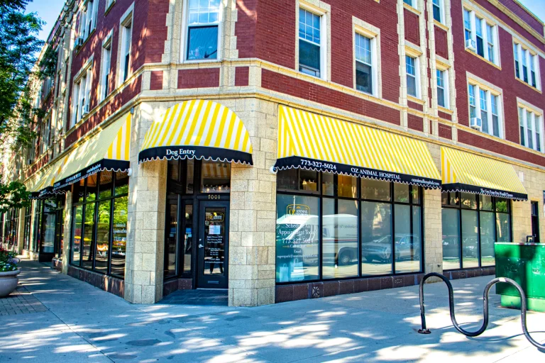
An awning sits in the shopper’s line of sight. It projects from the facade, so people see it walking toward the door from either direction, not just head-on. That’s the same reason blade signs work on busy sidewalks.
Awning signs also do double duty. The same structure that carries your name shades the window, shelters the entrance, and keeps rain off customers. Few signs can claim a second job, and on a narrow facade with little wall space, an awning may be the only place a large name fits.
For restaurants, salons, and retail shops, a branded awning is often the piece of the storefront people remember.
Store Awning Design: Choosing the Shape
Shape is the first decision in store awning design, because it sets the style of everything else. These are the common profiles for awning signs:
| Shape | Look | Best for |
|---|---|---|
| Traditional slope | Classic angled face with a valance | Most storefronts, cafés, and shops |
| Dome | Rounded, often over arched windows | Entrances and historic facades |
| Concave or convex | Curved face, inward or outward | Boutiques and design-forward brands |
| Waterfall | Slope with a curved, rolling front | Restaurants and upscale retail |
| Box or flat | Square, modern profile | Contemporary buildings and offices |
Match the shape to the building, not just the brand. A box awning on a vintage brick storefront can look bolted on, while a dome over a square modern window looks out of place. In snowy climates, steeper slopes also shed snow better, which our guide to snow awnings explains.
Fabrics for Awning Signs
The fabric decides how the graphics look, how long the color lasts, and if the awning can be lit from behind.
- Acrylic canvas. Woven fabrics such as Sunbrella have a soft, matte look and strong color retention. They suit traditional and upscale storefronts.
- Vinyl-laminated fabric. Covers such as Patio 500 are water-resistant, easy to clean, and print well, which makes them a strong choice for detailed logos.
- Translucent vinyl. Backlit awning signs need a fabric that lets light pass through evenly.
All of these sit on a welded or bolted frame, usually powder-coated aluminum. The frame counts as much as the fabric, because a sagging frame wrinkles even the best graphics.
Color, Lettering, and Placement
The best store awning design keeps the message short and the contrast high. A few rules hold for almost every storefront:
- Put the name on the valance. The front flap is closest to eye level and reads straight on. The sloped face is better for a logo or a large name seen from across the street.
- Use two or three colors. Pick a fabric color, then a lettering color with strong contrast against it. White on a dark awning or dark on a light one reads farthest.
- Size letters to the distance. The United States Sign Council’s legibility guidelines use about 30 feet of viewing distance per inch of letter height as an average benchmark, and busy streets need larger letters.
- Keep the copy short. A name and one line, such as a phone number or what you sell, is plenty. Long lists turn into clutter at a distance.
- Repeat on the sides. Lettering on the side panels catches people walking along the sidewalk toward the door.
Lettering can be heat-applied vinyl, digitally printed, or painted, depending on the fabric and the detail in the logo. Your sign company should recommend the method that holds up best on the fabric you choose.
See your awning sign before it’s built
SignFreaks mocks up the shape, colors, and lettering on a photo of your own storefront, so you can compare options before anything is cut.
Lighting Awning Signs
An unlit awning disappears after sunset. Lighting keeps awning signs working into the evening, a must for restaurants, bars, and shops with late hours.
- Backlit awnings. LEDs inside the frame shine through translucent vinyl, so the whole awning glows like a lightbox.
- Downlighting. Lights under the awning wash the entrance and the sidewalk, making the door easy to find.
- Gooseneck or spot lighting. Fixtures above or on the awning light the lettering from the front.
For a sign that reads at night from farther away, many storefronts pair an awning with channel letters on the fascia above it.
Permits and Installation for Awning Signs in Chicago
In Chicago, awning signs over the sidewalk count as structures over the public way. The City of Chicago requires a Department of Buildings permit first, then a Grant of Privilege through the Department of Business Affairs and Consumer Protection, which goes to City Council for approval. Suburbs set their own size and clearance rules.
SignFreaks prepares the drawings and files the sign permits, then handles installation with our own crew. For a recent example of that process on a larger structure, see the McDonald’s storefront canopy case study.
Common Awning Sign Mistakes
Most weak awning signs fail for the same few reasons, and each one is easy to avoid at the design stage:
- Lettering too small for the street. A name sized for the sidewalk disappears for drivers. Size it for the farthest viewer you need to reach.
- Too much copy. Phone numbers, hours, and a list of services on one valance turn into noise. Put the extra details on the window instead.
- Fabric that fights the facade. A bright awning on a busy, multicolored building gets lost. Pick a color that stands apart from the wall.
- Ignoring the landlord. Many shopping centers and mixed-use buildings set awning colors and lettering rules in the lease. Read them before the design starts, as our shopping mall signs work always does.
What Affects the Cost of Awning Signs
Every awning is quoted from its own measurements, so there’s no flat price. These factors move the number:
- Size and shape. Longer spans, deeper projections, and curved profiles take more frame and fabric.
- Fabric and graphics. Printed full-color logos and premium fabrics cost more than single-color lettering.
- Lighting. Backlit frames add LEDs, power supplies, and electrical work.
- Access and permits. Lift work, wall conditions, and city approvals each appear on the quote.
Getting Awning Signs Right the First Time
Awning signs earn their keep when the design fits the building and the street. Choose a shape that suits the facade, a fabric that holds color and can be lit if you need it, high-contrast lettering sized for your viewing distance, and lighting for the hours you’re open.
SignFreaks designs, permits, builds, and installs commercial awnings, patio awnings, and commercial canopies for storefronts across Chicago and the suburbs. Finished projects are in the portfolio.
Turn your awning into your best sign
Send SignFreaks a photo of your storefront. We’ll design the awning sign, handle the permit, and build and install it with our own crew.
Awning Signs FAQs
What are awning signs?
Awning signs are awnings that carry a business name, logo, or message on the fabric, valance, or frame. They shade the entrance and act as a storefront sign at the same time. SignFreaks builds branded commercial awnings for businesses across Chicago.
Where should lettering go on an awning?
Lettering on an awning reads best on the valance, the front flap closest to eye level. The sloped face suits a logo or a large name seen from across the street, and the side panels catch people walking along the sidewalk.
Can an awning sign be lit at night?
An awning sign can be lit at night with LEDs inside the frame behind translucent vinyl, with downlights under the awning, or with gooseneck lights aimed at the lettering. Many storefronts also add channel letters above the awning for nighttime reach.
Do awning signs need a permit in Chicago?
Awning signs in Chicago need a permit, and an awning over the sidewalk also needs a Grant of Privilege and City Council approval. SignFreaks prepares the drawings and files the sign permits for every awning we build.
How long do awning signs last?
Awning signs last for years when the frame is powder-coated metal and the fabric is UV-resistant acrylic or vinyl. Covers can be replaced on the existing frame when a brand changes or the fabric wears, and our sign repair crew handles re-covers and frame fixes.