The most useful banner design tips come down to seven rules: keep the message to a few words, size the banner and its letters for the viewing distance, stay on brand, use high-contrast colors, pick bold fonts, build a clear visual hierarchy, and design for the banner’s purpose. Outdoor banner design adds one more: choose a material and finish that hold up to wind and weather.
A banner gets about as long as it takes someone to walk or drive past it. If they can’t read it in that moment, it might as well be blank. Most weak banners fail for the same reasons: too many words, letters too small for the distance, and colors that blend together.
These banner design tips fix that. SignFreaks prints banners for storefronts, events, and construction sites every week, and the same rules come up on nearly every job. They apply to storefront banners, grand-opening signs, event backdrops, and trade show displays, with extra guidance for outdoor banner design where wind, sun, and distance all work against you.
- Fewer words, bigger letters. A headline and one supporting line is usually enough.
- Distance sets the size. Letter height should match how far away readers stand or drive.
- Contrast beats color count. Two or three strong, contrasting colors read farthest.
- Outdoors needs tougher stock. Heavier vinyl or mesh handles wind and sun.
1. Keep the Message Short
The first of all banner design tips is the hardest to follow: say less. A banner isn’t a brochure. Aim for a short headline, one supporting line, and a call to action, such as “Grand Opening Saturday” or “Now Hiring, Apply Inside.”
- One idea per banner. If you have two messages, print two banners.
- Cut filler words. “Custom Signs That Get Noticed” beats “Our company offers high-quality custom signage at affordable prices.”
- Make the action clear. “Call Now,” “Visit Today,” or a short web address tells people what to do next.
2. Size the Banner and the Letters for the Distance
How far away will people be when they read it? That one question decides both the banner size and the letter height. The United States Sign Council’s legibility guidelines use about 30 feet of viewing distance per inch of letter height as an average benchmark, so 6-inch letters read from roughly 180 feet in good conditions.
Real streets are busier than test conditions, so size up when the banner competes with traffic, other signs, or a cluttered facade. Measure the wall, fence, or frame before designing, and leave room for hems and grommets around the edges.
3. Stay on Brand
Branding is one of the banner design tips most often skipped. A banner should look like it came from your business. Use the same logo, colors, and fonts as your storefront sign, website, and vehicles, so people connect the banner to the brand at a glance. Consistent branding also makes a temporary banner look intentional rather than improvised.
4. Use High-Contrast Colors
Contrast is what makes a banner readable from across a parking lot. Dark text on a light background, or light text on a dark one, reads farthest.
- Avoid similar tones. Red on orange or navy on black turns to mush at a distance.
- Limit the palette. Two or three colors, used with purpose, beat a rainbow.
- Use accent color for the action. A single bright color draws the eye to the call to action.
- Check the backdrop. A banner on red brick needs a different color plan than one on a white fence.
Colors also look different printed than on a screen, so ask for a printed proof or a scaled mockup before the full run.
5. Choose Fonts You Can Read From Afar
Bold, simple sans-serif fonts read best at distance. Thin, decorative, and script fonts may look elegant up close, but they blur from across the street.
- Use no more than two fonts: one for the headline, one for supporting text.
- Give letters room. Tight spacing makes words merge at a distance.
- Avoid long lines in all capital letters, which slow reading.
6. Build a Clear Visual Hierarchy
People read a banner in a set order: the biggest element first, then the next biggest. Decide that order on purpose.
- Headline or offer. The largest element on the banner.
- Logo or business name. Big enough to recognize, but not competing with the headline.
- Call to action. A phone number, date, or web address, set apart with color or space.
Leave generous empty space around each element. A crowded banner forces the eye to search, and most people won’t bother. High-resolution images help, but only if they support the message. One strong photo beats a collage.
Want a banner that reads from the street?
SignFreaks sizes each banner to its viewing distance, prints it in our own shop, and hangs it with our own crew.
7. Design for the Banner’s Purpose
Every banner has a job, and the best banner design tips all point back to it. A grand-opening banner needs urgency and a date. A trade show banner needs a clear statement of what you do. An event backdrop needs repeating logos for photos, like our step and repeat banners, which our guide to what a step and repeat is covers in detail.
Think about the audience, too. Professional services lean toward clean layouts and restrained colors. Retail, restaurants, shopping centers, and events can use bolder visuals that create energy.
Outdoor Banner Design: Extra Tips
Outdoor banner design adds weather, wind, and long viewing distances to the mix. These choices keep an outdoor banner readable and intact:
- Choose the right weight. Heavier 13 oz and 18 oz vinyl holds up better outdoors than light stock.
- Use mesh in windy spots.Mesh banners let wind pass through, which protects fences, scaffolding, and the banner itself.
- Finish the edges. Hemmed edges and grommets at the corners and along the sides keep the banner from tearing.
- Go bigger and bolder. Outdoor banners compete with traffic and other signs, so letters should be larger than indoor ones.
- Check the local rules. Many towns limit how long temporary banners can stay up and where they can hang, and some require sign permits.
For a storefront that needs a permanent message, a banner is a stopgap. Window wraps, wall wraps, or a permanent sign last far longer, and the types of business signs guide compares the options.
Large banners hung on buildings and fences are some of the most visible pieces we print, and each one is cut to the wall it hangs on.
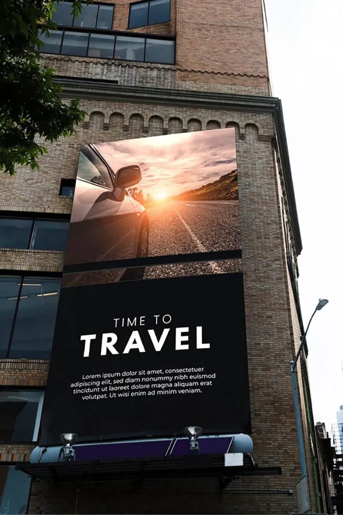
Size, material, and hanging hardware are planned together, so the banner fits the space and stays up through the wind.
Common Banner Design Mistakes
Even with the right tips in mind, a few mistakes show up again and again:
- Low-resolution images. A photo that looks fine on a phone can turn blurry when printed several feet wide.
- Text too close to the edge. Hems and grommets eat into the border, so keep important text well inside.
- Too many messages. A banner that tries to say everything ends up saying nothing.
- Ignoring the background. A banner designed on a white screen may vanish against the wall it hangs on.
Putting These Banner Design Tips to Work
Good banners follow simple banner design tips: a short message, letters sized for the distance, brand colors with strong contrast, readable fonts, and a clear order of importance. For outdoor banner design, add the right material and finishing so the banner survives the weather.
SignFreaks prints printed signs of every kind, including custom vinyl banners, large-format banners, and retractable banners in our own shop, and our crew handles banner installation and banner removal across Chicago and the suburbs.
Get a banner designed, printed, and hung
Tell SignFreaks where the banner will hang and what it needs to say. We’ll design it for the distance, print it in our shop, and install it.
Banner Design Tips FAQs
What makes a good banner design?
A good banner design has a short message, letters sized for the viewing distance, high-contrast colors, bold fonts, and a clear order of importance. Every element should support one main idea. SignFreaks designs and prints custom vinyl banners for businesses across Chicago.
How big should the text on a banner be?
The text on a banner should be about one inch tall for every 30 feet of viewing distance, as an average starting point. Banners on busy streets or read from moving cars need larger letters.
What colors work best on a banner?
The colors that work best on a banner are high-contrast pairs, such as dark text on a light background or light text on a dark one. Limit the design to two or three colors, and use a bright accent for the call to action.
What material is best for an outdoor banner?
The best material for an outdoor banner is heavy 13 oz or 18 oz vinyl with hemmed edges and grommets. In windy locations, mesh banners let air pass through and reduce stress on the banner and its supports.
How many words should a banner have?
A banner should have as few words as possible, usually a headline, one supporting line, and a call to action. If the message needs more, split it across two banners or move the details to a flyer or the window.